We have been in the process of remodeling our house since July. It’s part of the reason I’ve neglected the blog a bit. Sitting around recovering from hernia repair surgery has freed up my time to catch up blogging. So here’s the big reveal on the master bathroom, although it’s been done for about a month now.
We hired a contractor to do all the work for us. We could probably do some of the the work ourselves, but we just didn’t want to. Our contractor is the owner of Remington Construction and is a friend of the family, therefore we trust him implicitly. The work was high quality and done within the expected time frame and budget. We couldn’t be happier!
We did pick everything out and put it together. I felt confident in my ability to pick what I wanted and have it come together. My husband let me have more say in the master bath, while I’ve let him have more say in the basement (almost done with that space as well). I wanted a hotel/spa feel to the bathroom, with a lot of natural feeling elements. This meant all neutral colors.
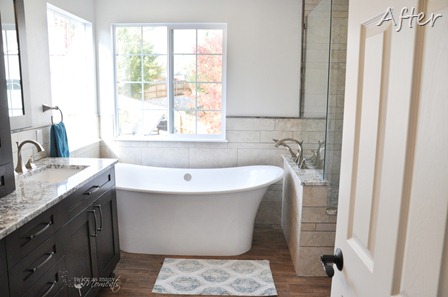
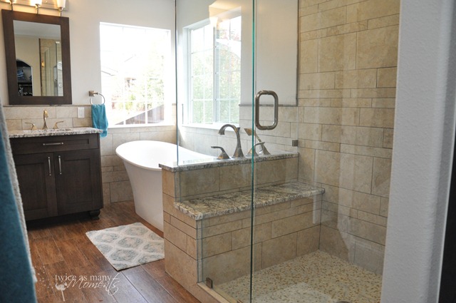
This is the view upon entering the bathroom. We haven’t put new blinds up yet, but they’ll be a similar style. We had the windows framed out to help them look finished.
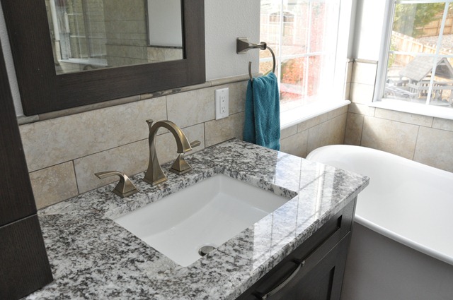
We chose the cabinets first and I fell in love with the rift oak with weathered slate finish (gray stain+glaze). Everything was custom made for the space which meant we also helped design the layout. We planned to remove the medicine cabinet so we added the middle cabinet to replace it. I love the hardware too, something the cabinet guy recommended. I also wanted real storage in the toilet closet, so we had a cabinet made to fit the space. I also chose light fixtures to have a similar shape to the tub. The mirrors are empty 24” x 36” cabinet doors with mirror installed into them.
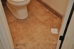
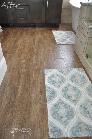
Then we chose tile for the backsplash, shower, wainscoting, and floor. I have always wanted wood floors in my bathroom, but that much water plus wood seems completely impractical. So I chose a porcelain tile that looks like wood to replace the carpet and tile in the toilet closet. We also had radiant heat installed—it’s just fantastic.
I was inspired by this tile pattern, but wanted something more neutral with less ‘texture’ in the tile. I found a porcelain tile that was similar and had the tile guy make the right cuts in both 20” and 13” for the non-pattern pattern. I also liked the slate pencil edge to finish everything off. The wall color is Glidden Designer Grey, a nice greige (beige + gray).
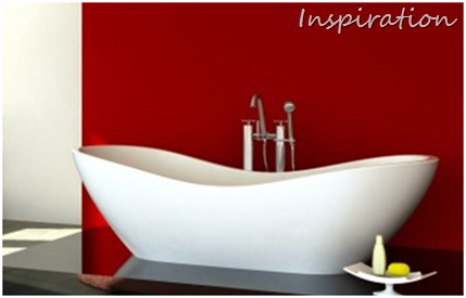
Next we picked all the hardware and fixtures. I was inspired by this bathtub and found one that had similar lines.
We found a sink that had a similar curve, and then found brushed nickel faucets with the perfect twist detail. We went to the granite fabricator and chose a remnant in the yard by bringing our tile, flooring, and cabinet stain with us.
We designed the shower to have a fixed head, 3 body sprays, and a hand sprayer plus inset shelves installed. 
I wanted a bench to shave my legs so we used that to also build a pedestal for the bathtub hardware to avoid the cost of putting it on an exterior wall. We used seamless glass and the door opens both in and out for the shower.
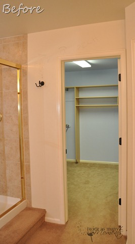
We moved the closet wall back to make room for the larger tub and shower and removed the door to make an arched doorway.
We used some of the closet space for the bathroom, but made both spaces more functional. Our contractor custom made our closet and had the oak stained to match our cabinetry. There is more than enough room for all our things, and we aren’t short on closet space in our house so I didn’t mind losing some of the space.
I LOVE using our master bathroom and I am very proud of how it all came together.
Edited to answer some common questions:
Tub: Victoria & Albert Toulouse
Granite: It was a remnant, White Delicatus
Hardware: Brizo Virage series in brushed nickel
Rug: Fieldcrest bath rug from Target
Wall Tile: Castello Bianco
Floor Tile: Serenissima Barrique Castagno
Shower Floor Tile: White Onyx Mosaic Marble Tile (I think that’s the right one…here is the stick version from Floor & Décor where we purchased the mosaic tile)
Wall pencil edge: Autumn Slate Pencil
Paint Color: Glidden Designer Grey











5 comments:
Absolutely GORGEOUS! You guys did a great job. I don't think I'd ever leave the bathroom!!
Your bathroom makeover is amazing. I am drooling! (You'd know why if you saw ours.) How do you ever leave there? haha! It's gorgeous!
Roeshel
This is so beautiful!! I dream of someday making changes like this to our bathroom. What a wonderful space!
Beautiful! It turned out great!
The remodel looks great!! I would swear it is straight out of a magazine!!
Post a Comment